RGB, CMYK, Pantone, Hex code? What’s the difference?
While we can talk about colors all day, let’s just cover the basics.
Color Spaces: What are they?
Graphic designers tend to be visual people. They’ve created a handy little map of “spaces” colors exist within a given system or color model – but you can also think of each color system like a language for communicating a specific color. The same way you can fumble through ordering lunch in a foreign country by miming eating a sandwich and then hoping for the best, more often than not, you can probably get away with operating in the wrong color space. However, you’ll need to be just as flexible and understanding when your color doesn’t exactly match your brand as you are when you’re traveling and don’t know the language. How do we avoid these miscommunications? Learn the language. Or at least the key phrases and when to use them.
- Pro-tip: Make sure that your branding guide includes the color values for each color space.
Hex Codes (i.e., hexadecimal format)
A color system used in HTML, CSS, and SVG—working on a project in Canva? Hex codes are what you need! Each hex code refers to a particular color and allows you to collaborate with others on your team to ensure that you are all talking about the same neon orange.
Rgb Use for Digital Display (i.e., screens)
Think back to being a kid and wondering about rainbows. The full-color spectrum in sunlight breaks down into individual colors (wavelengths). The RGB system uses light to build colors. RGB values refer to the intensity of red, green, and blue light needed to create a specific color.
Cmyk Use for Standard Printing
RGB uses light to create color. CMYK, however, is the process of printing small dots of colored ink on a white piece of paper to create an image. What combination of Cyan, Magenta, Yellow, and Black (K) ink creates a specific color? CMYK values represent the individual percentage of each color ink that makes the specific color combination (they add up to 100).
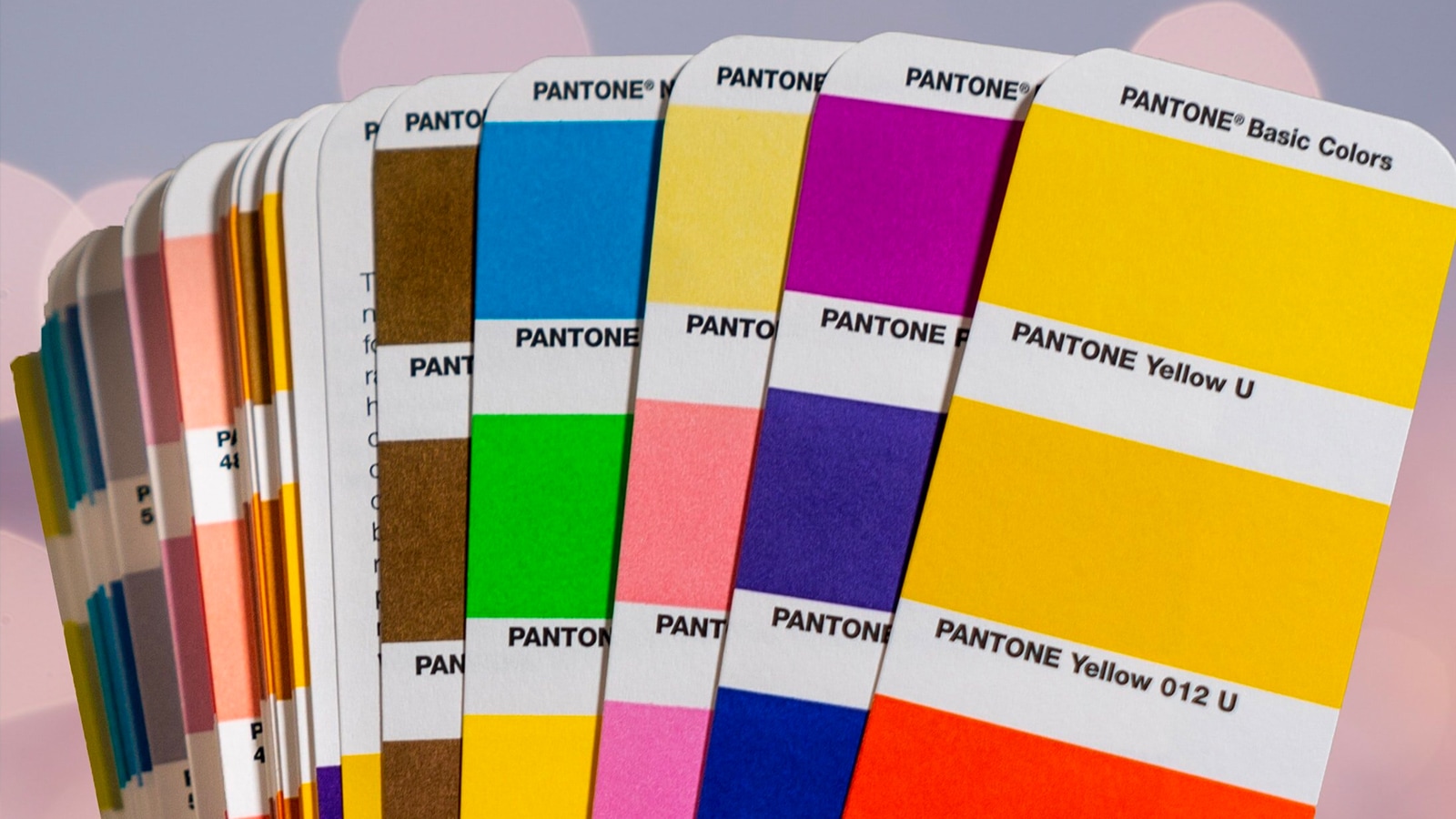
Pantone Use for Offset Printing
Pantone color space is what most people think of when they think about mixing a color—paint. Pantone colors are specifically mixed from an extended range of color inks to create a unique color. While digital printing has come a long way, and the products are often almost indistinguishable from offset printing, the clarity, consistency, and brightness of Pantone colors make them ideal for logos and branding.
Still feeling a bit confused and want to talk more about using color in your brand most effectively? Then, schedule a consultation with us, and let’s dig deep into your visual brand identity!
The M Dash
Articles about strategy, sustainability, and making the world a better place.